
Switchd (Copy)

“What’s the difference between Switchd and a comparison site?” Explaining Switchd’s value and helping users understand the ongoing service they provide.
2.5 weeks | Group Project | Client
As a team we worked with a start-up in the energy industry. In order to identify usability issues we began by gathering data by interviewing users and running usability tests of the existing website, conducting heuristic and competitive analysis, facilitating design studios at the client’s office. After synthesising this data we used insights to create scenarios and journeys to test using interactive prototypes iterating on our design and delivering a hi-fidelity interactive prototype.
Switchd is an automated energy switching service, using an algorithm to check and compare energy tariffs for customers ensuring Switchd customers are paying the lowest possible energy prices based on their energy preferences and requirements. Switchd handles communication and administration between energy suppliers during a provider switch saving the customer time and money.
Brief
We were tasked with increasing the conversion rate from site visitor to customer, focusing primarily on the mobile experience.
My Role
We worked in a team of three and whilst all responsibilities were shared over the course of the project, I paid particular attention to certain areas I personally wanted to improve in, such as UI and visual design, user testing and interviewing.
Intial thoughts
We had two significant assumptions, peoples understanding of the service Switchd offer and user’s lack of confidence in Switchd’s service (likely due to a lack of understanding). We had access to previous research and data demonstrating key drop-out points. We decided to establish if the reasons for leaving the site at various points were due to our assumptions.
What we wanted to find out
What are the reasons for higher drop-out rates on particular pages?
Do users trust Switchd? If not, then why?
Do users understand Switchd’s proposition?
Is a limited understanding the cause of any mistrust?
What we knew
The rates of user drop-outs and points at which drop-outs were most significant.
The conversion rate for users using mobile devices is half that of those using desktop and laptop devices.
Those who did sign up for a paid plan picked the second most expensive plan more often than the least expensive plan.

Research
Our research phase consisted of:
9 interviews surrounding typical experiences with and attitudes towards energy suppliers and the process of changing supplier.
An audit of the UX on the existing Switchd website.
5 user tests on the existing website.
10 reviews of competitor websites. Are there any best practices not currently utilised by Switchd?
What are people’s general attitudes towards and understanding of energy industry and switching suppliers?
We interviewed individuals, using a screener survey to ensure we involved the correct participants for interview, to identify pain points in the traditional ways of changing supplier. Locating user pain points helped us to understand how to communicate that Switchd can offer a solution to these pain points.
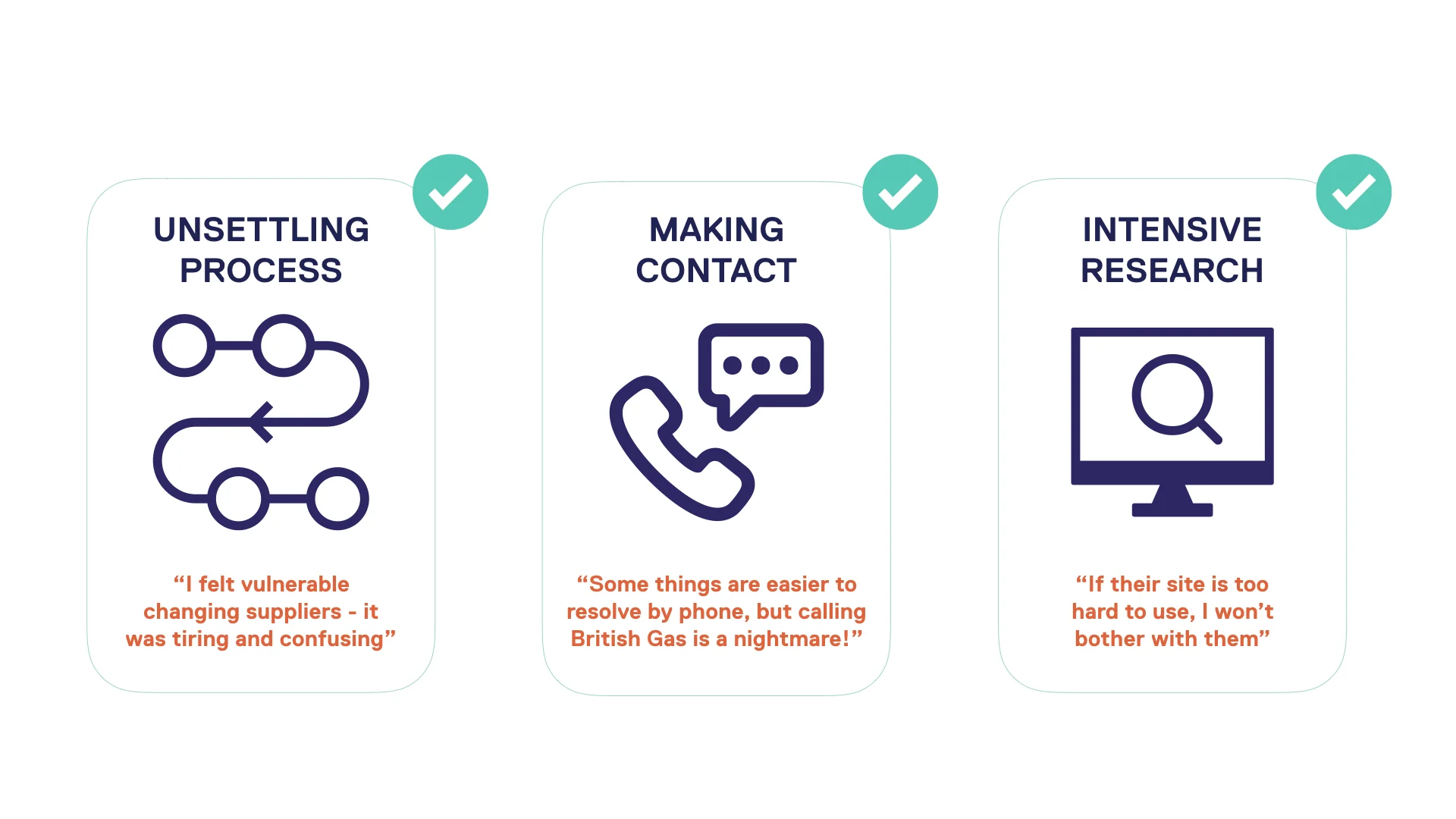
Switchd solves each of these problems already. Potential customers often don’t find out enough to realise it.
Testing Switchd’s Existing UX
During tests of the existing user journey some of the most common questions or reactions were characterised by surprise and confusion;
Surprise that it is a paid service.
Confusion about why it is beneficial to choose one of the more expensive paid plans when all paid plans save the same amount on energy bills.
Surprise that six months of payment is paid upfront, this is confusing because the payments are outlined as monthly on the site.
The upfront payment also causes surprise as users had previously read that “ you don’t pay a thing until you save £50”, yet they are being charged immediately. This leads to frustrated users who are confused about how the saving threshold works.
Using affinity mapping we were able to synthesise our raw data and identify trends in user behaviour, knowledge levels and common pain points. From these insights our persona, scenarios and testing scripts were created.
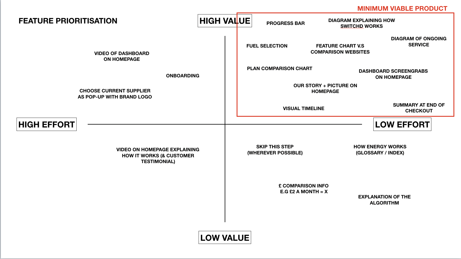
Design
A clearer explanation of the product and its value would justify the fee. Likewise, approaching it from the other direction - explaining exactly why a fee is higher or present at all is an opportunity to provide further information to increase understanding and demonstrate value.
During this phase we utilised:
Design studios - both with the client and within the design team.
4 interactive prototype iterations.
3 rounds of user testing.


Explaining the proposition

Copy
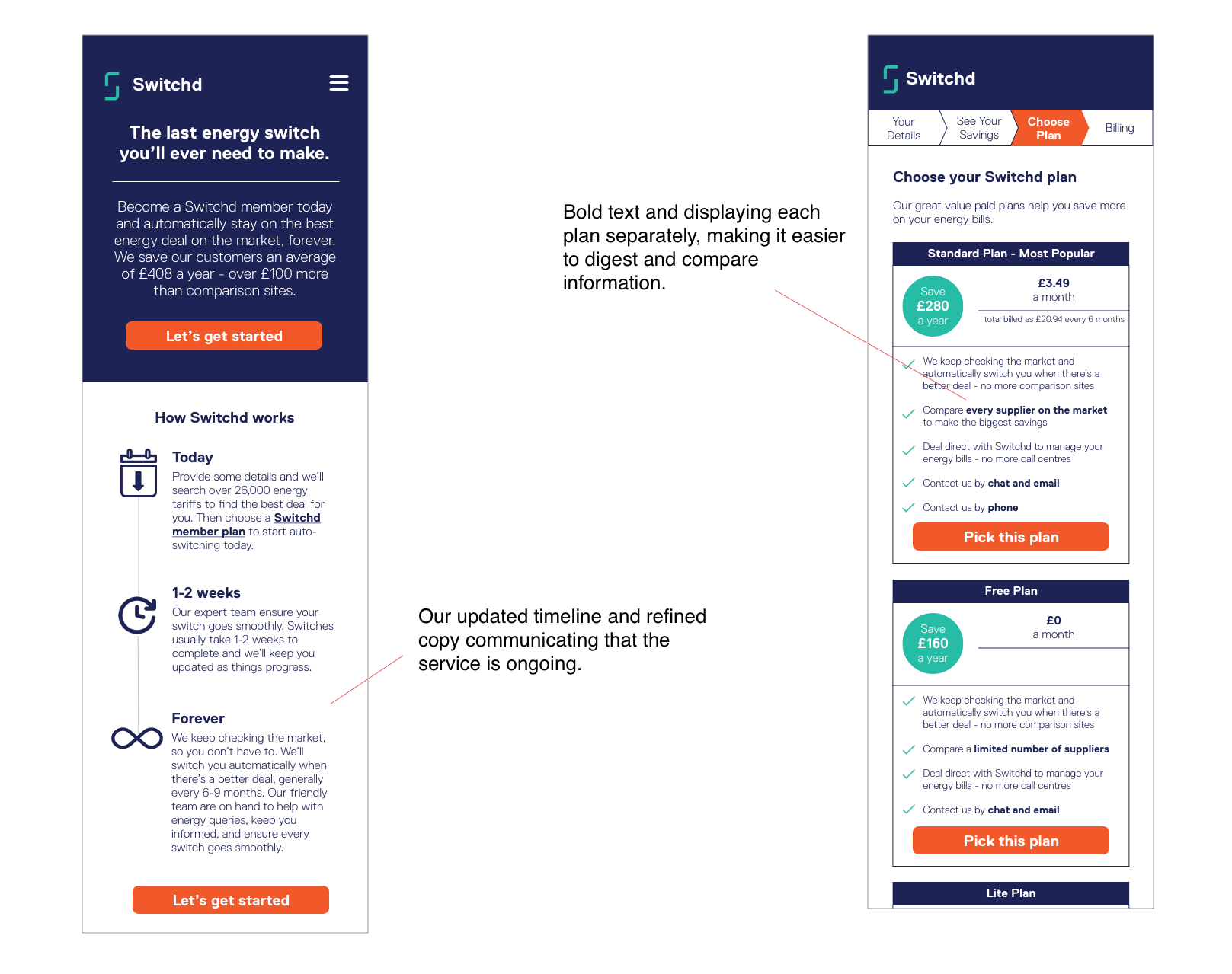
Some changes are fairly subtle but all add up, introducing the word “membership” in front of the word “plan” is a way to imply there is a fee involved without scaring users with pressure or the prospect of commitment too early on.
Timeline
Switchd already utilised a timeline, however it failed to explain crucial information regarding frequency and regularity. Refining the copy with each iteration resulted in a graphical timeline that better explains that the service they provide is long-term rather than a one-off. Proven to be a particular point where users were most positive and engaged we then relocated it from its previous place at the bottom of the page, positioning it to be viewable above the fold, just below the hero message on the homepage.
Comparing Plans
Rather than opting for a feature comparison table we iterated a more digestible and visually appealing format in which each plan is displayed independently, with bold text used to highlight notable or extra features.
Improving Usability


Increasing clarity
Method and frequency of payment affects which tariffs you can choose. Generally online transactions only require details about payment in order to complete the transaction. We found that the extra questions on the subject of payments caused users to either feel uneasy (“why am I answering a question about payment already?”) or frustrated (“I’ve already been asked about how I would like to pay, why am I being asked again?”). To combat this we added additional copy providing an explanation and clearer context to each question. This allowed users to move through the rest of the process more quickly and confidently.
Another notable example of something causing uncertainty is where sections of the form filling process contain questions regarding two separate subjects within a single page. Separating unrelated information might result in more steps or more clicks but in testing the increased clarity to each step resulted in quicker progression overall.
Help Icons
Testing using a scenario in which users are on their commute and using a mobile device meant there were points where users were unable to provide complete or accurate information and so needed extra guidance. The help icons were absent on the mobile experience of the website so we introduced revised versions, making sure they provided relevant and clear information that responded to specific friction points discovered in user tests.
(Only one of these was included in the interactive prototype, but copy for each was written and delivered to the client. During usability tests we had the “?” icons and would ask user who attempted to click what type of information they were looking for).
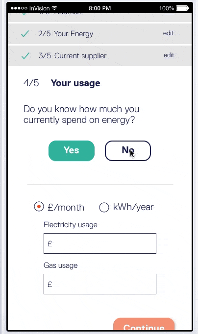
The “I Don’t Know Journey”
In Switchd’s existing journey, if you don’t know your current usage in either kWh or monthly cost there is an estimator based on property size. However, in testing a number of users questioned its accuracy. In response ours asks for slightly more detailed but still easy-to-answer information. This proved to reassure users that the quote is adequately accurate.

Outcome & Learnings
This project really improved my observational skills during user testing. Many of the necessary changes were relatively subtle meaning that during testing difficulties users were encountering were hard to explain, therefore carefully watching for non-verbal information from users became particularly important. Working with a client on a live project was incredibly valuable, not only in working with different pressures and limitations but in helping me to further realise the value of involving the client in and explain the process and how to do so most effectively.
“It was highly impressive what Ian and the rest of the team managed to achieve and discover in just a few weeks. We have since implemented a number of their recommendations and are planning to roll more changes out over the coming months” -Morgan Young, Head of Growth at Switchd.